
Gerrymandering

full version available at GitHub
Partisan Advantage:
A Quantitative Assessment of California’s Proposition 50
On November 4th, 2025, California voters were presented with Proposition 50, a pivotal measure seeking to adopt a new congressional district map (AB 604) drafted by the state legislature. This project investigates the potential structural shifts in political representation that would result from moving away from the 2024 district boundaries. By applying historical 2024 General Election voting data to the proposed 2025 geography, this analysis provides a data-driven forecast of how legislative lines influence election outcomes.
Research Purpose
The core objective was to determine whether the adoption of the AB 604 district map would lead to an increase in partisan advantage relative to the 2024 landscape. Beyond a simple "yes or no," the project aimed to quantify this shift using established political science metrics, providing voters and policymakers with a clear measure of the map’s fairness, competitiveness, and potential for gerrymandering.
Sources
Key inputs included:
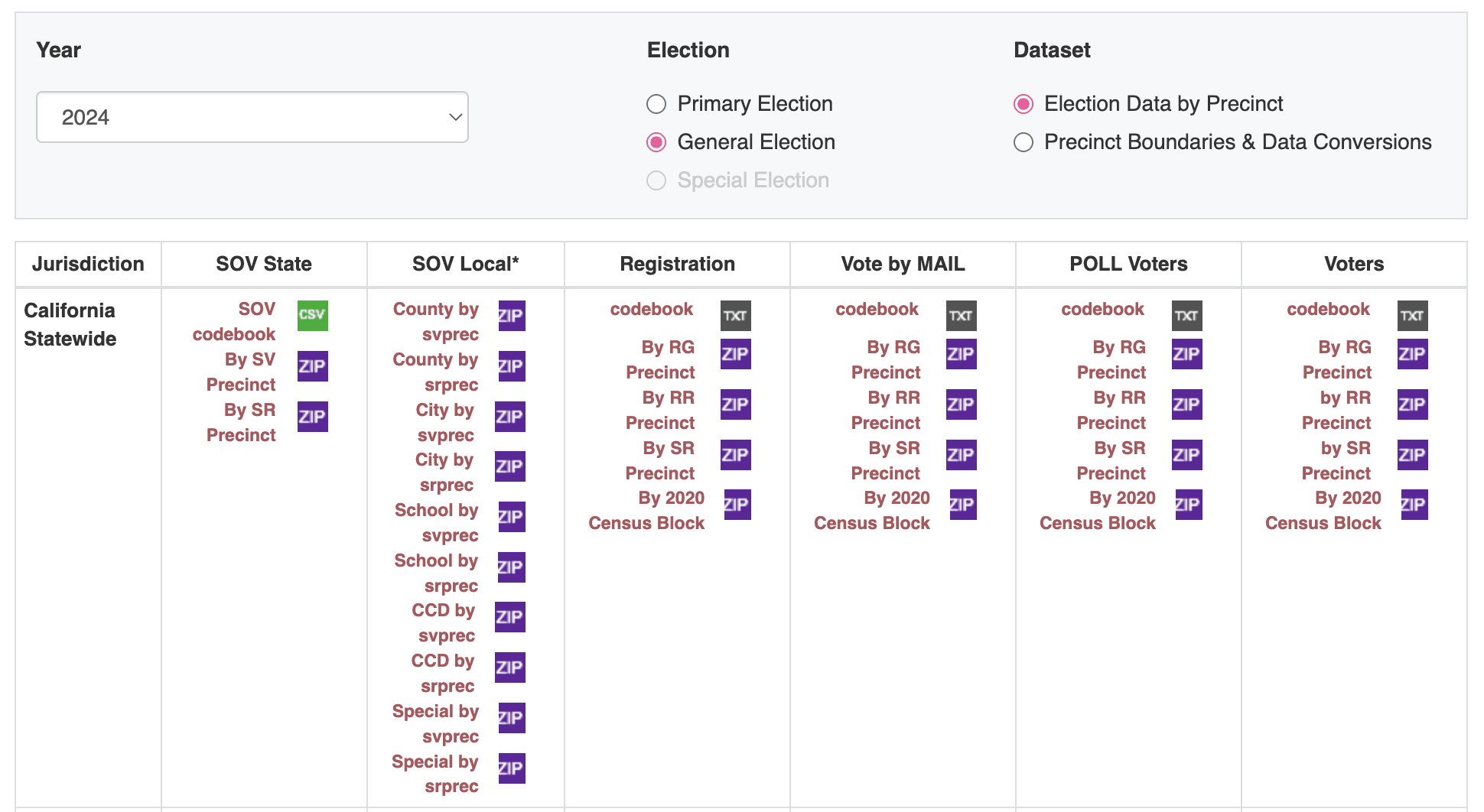
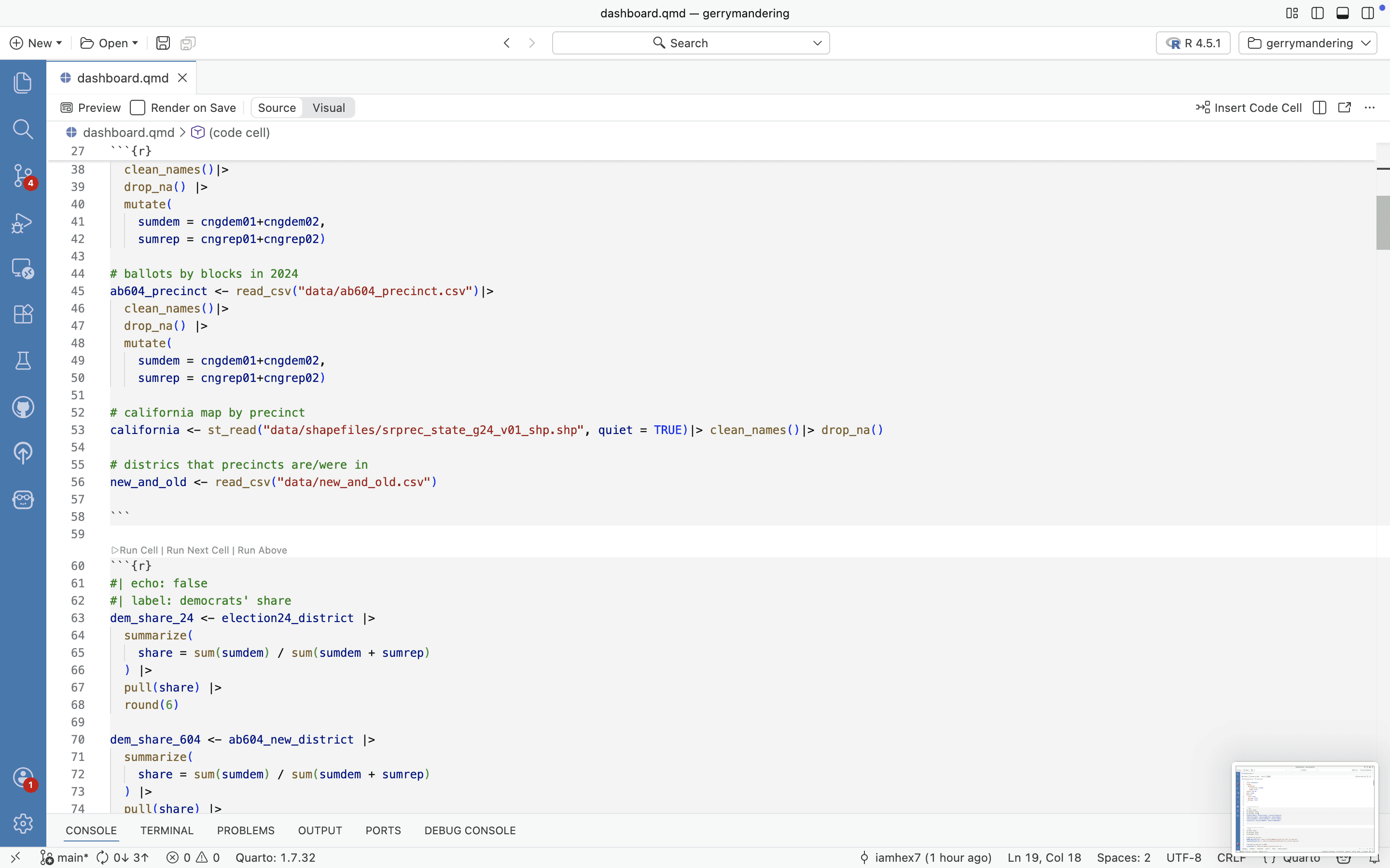
Statement of Vote (SOV): Precinct-level results from the 2024 General Election.
Geographic Shapefiles: Precinct maps and census block data used to bridge the gap between 2024 and 2025 boundaries.
Legislative Documentation: The specific district assignments defined in bill AB 604.
Methodology
The project followed a rigorous data pipeline:
first, cleaning and standardizing raw precinct-level vote counts;
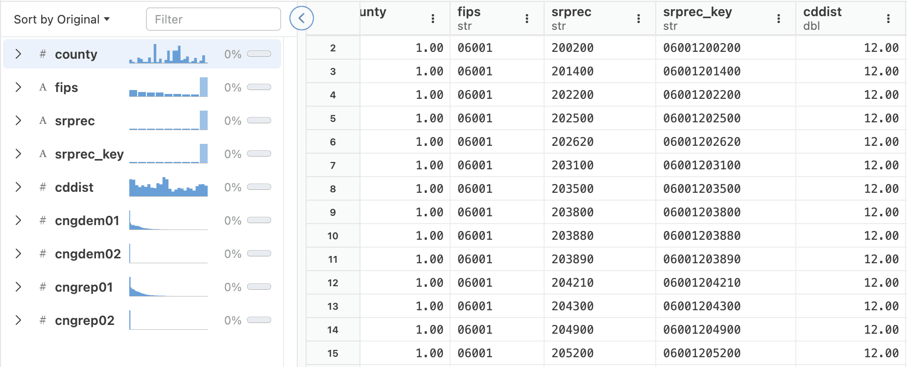
second, performing Proportional Allocation (Approach B) to reassign 2024 votes to new 2025 districts based on census block registration data ;
and finally, calculating comparative metrics to assess partisan bias across both maps.
Part I: Data Cleaning
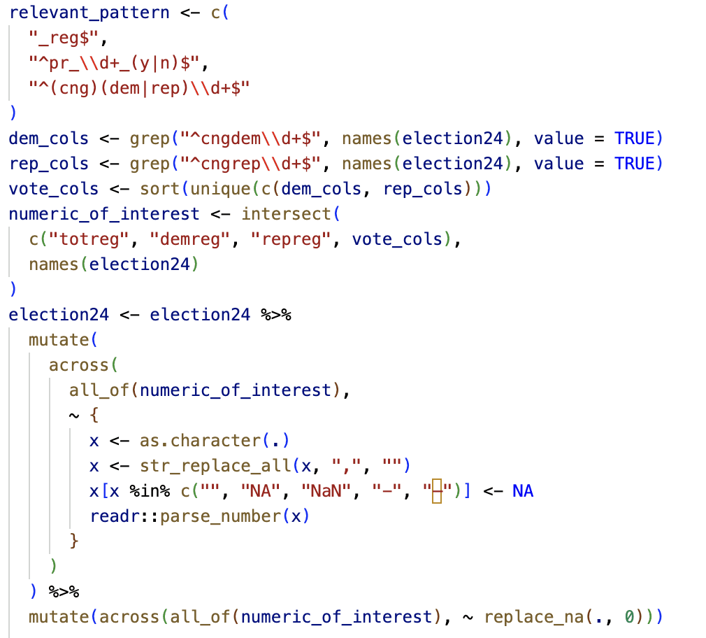
The cleaning phase focused on ensuring data integrity across thousands of rows. Using R, I implemented a regex-based pattern matching system to isolate U.S. House (CNG) votes, filtered out empty "ghost" precincts, and handled missing values by standardizing numeric types. Commas and special characters were stripped, and unregistered vote entries were replaced with zero to maintain a clean mathematical baseline for aggregation.
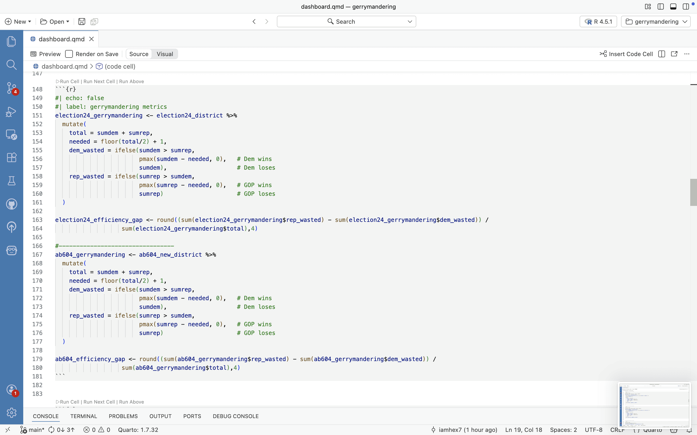
Part II: Metrics
To quantify "gerrymandering," I calculated two primary indicators:
Mean-Median Difference: Measured the asymmetry between the average and the median Democratic vote share across all districts to identify distributional bias.
Efficiency Gap: Aggregated "wasted votes" (votes cast for a losing candidate or surplus votes for a winner) for both parties to determine if one side was systematically disadvantaged.
Part III: Interactive Dashboard
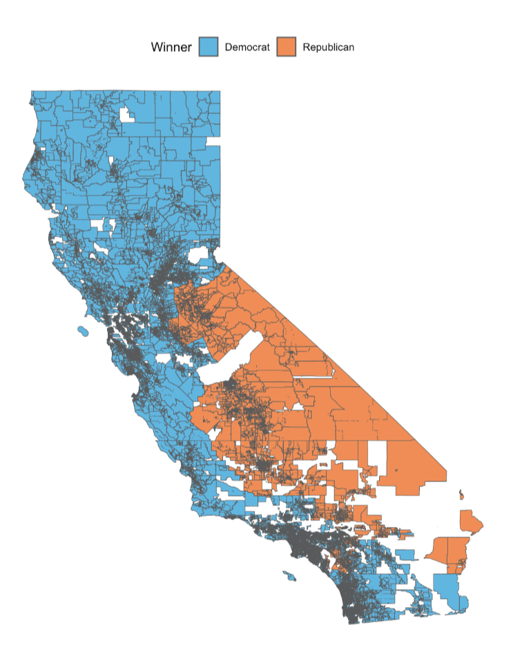
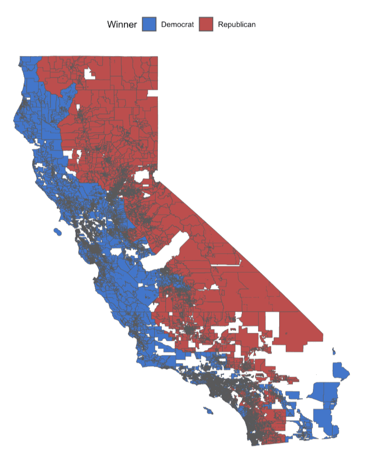
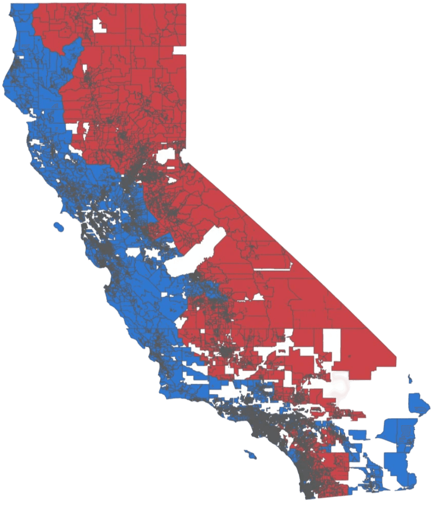
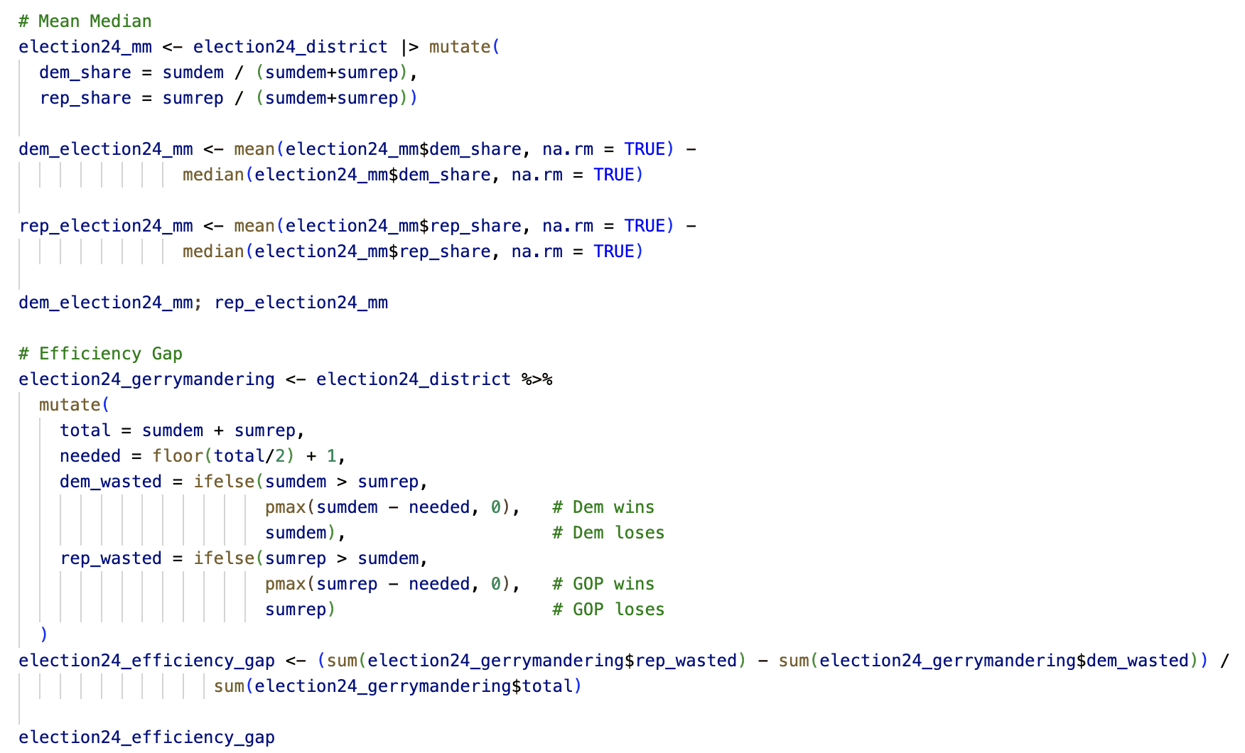
The final results were synthesized into an interactive Quarto Dashboard. Using a "brite" theme, the dashboard presents side-by-side comparisons of the 2024 and AB 604 metrics. It features Value Boxes for instant comparison of Efficiency Gaps and Democratic vote shares, alongside thematic maps that highlight the projected winners in each district under the proposed plan.
full version available at GitHub
Conclusion
The analysis revealed that the AB 604 map actually decreased the Efficiency Gap from 0.283 to 0.179. While the map maintains a partisan lean, the reduction in wasted votes suggests that the proposed 2025 districts are technically "fairer" and more competitive than the 2024 baseline. This project demonstrates that while individual statistics are not absolute proof of intent, they serve as vital signals for evaluating legislative fairness.